
Appearance
Banner slides
Rotating banners at the top of your homepage.
In Beentara:
- Path: Website / App → Homepage → Edit slides (
/slider) - Page title: Banner slides
- Permission: website.read
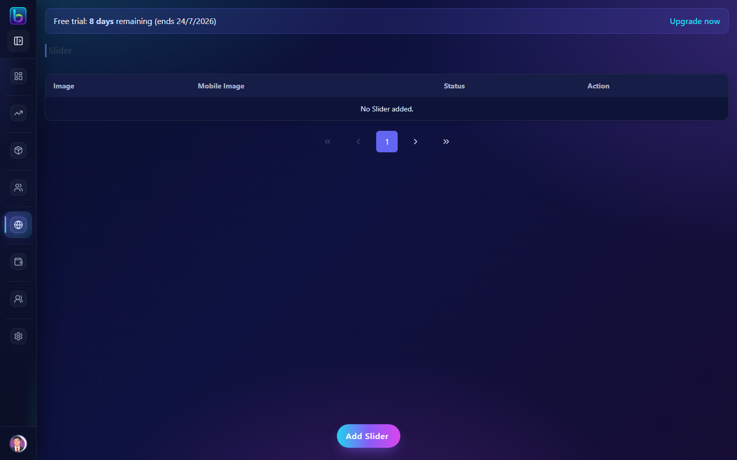 Slider — /slider
Opening the page
- Open Website / App → Homepage, then Edit slides on Banner.
- Or go to
/slider.
You need website.read permission where applicable (admins always have access unless noted).
Slide types
| Type | Use when |
|---|---|
| Image only | Full banner graphic; optional link or product. |
| Hero overlay | Background image + left text (eyebrow, headline, description) + up to two buttons. |
| Content + pricing (legacy) | Background + product image, title, prices, offer tagline. |
You can mix types in one carousel.
Hero overlay fields
- Desktop / mobile background — full-bleed art (recommended 1920×720+ desktop, 1200×800+ mobile).
- Background video (optional) — desktop and mobile URLs (library picker or paste); poster images when motion is reduced.
- Partner badges — logo row under copy (image + optional label/link per badge). Style: white, original colors, or dark-on-chip.
- Duplicate — copy icon on
/sliderand track sliders; new slide starts Inactive for review. - JSON template — Copy JSON template on one slide; Export all slides (JSON) for the whole carousel (
kind: beentara_banner_carousel). Import JSON template accepts either format (multi-slide imports create inactive slides via API). - Starter templates — dropdown on
/sliderfor built-in and File: presets (Admin/public/slider-templates/, mirrored underdocs/templates/slider/). - CMS pages — Puck blocks Homepage banner carousel (
/slider/all) and Track page banner carousel (/track-slider/all). Editor preview shows live active slide count. - Foreground image (optional) — product or lifestyle cutout on large screens.
- Eyebrow, headline lines, description
- Primary & secondary button — label + URL each
- Fallback link / product — used when buttons are empty or for whole-slide tap on image-only slides
Slide order
Use the Slide order panel at the top of /slider: drag slides to reorder. Order is saved automatically.
Theme defaults
Under Site theme → Hero / Banner carousel you can set:
- Autoplay, interval, arrows, dots
- Hero accent color (headline highlight & dots)
- Banner height: compact, medium, tall, cinematic, or custom (viewport %, min/max px)
- Whether the first slide headline uses
<h1>for SEO
Per-slide content still comes from Banner slides.
On each hero slide, open Look & feel in the slide editor to set overlay (including none), text/button colors, size presets, alignment, and text shadow.
Scheduling (optional)
On each slide you can set Show from and Hide after (your browser’s local date/time). Empty fields mean no limit on that side.
- Storefront and track pages only show slides that are Active and inside the window.
- Admin lists still show all slides (including inactive); badges read Scheduled, Timed, or Ended.
Key workflows
- Create image, hero, or content slides
- Drag to reorder
- Toggle Active / Inactive
- Set optional start/end times for campaigns
- Deep link:
?openSlider=trueopens the add slide modal
Related guides
- Track Slider —
/track-slider - Offers —
/offer - Media Library —
/media